
PDF chapter test TRY NOW
In the previous topics, we have learnt how to present the data using tables. Now, we shall learn how to represent the data graphically. In this session, we will learn about \(3\) graphical representation. They are:
- Bar graphs
- Histograms
- Frequency polygons
Bar graphs:
A bar graph is a pictorial representation of data which usually contains horizontal and vertical bars(say, \(x\) axis and \(y\) axis) whose lengths(\(x\) axis) have equal spacing between them and heights(\(y\) axis) vary according to the number of items.
Example:
Consider the following example.
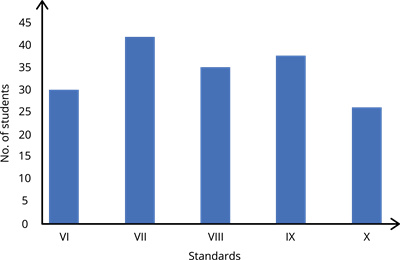
In a school, the number of students in a classroom are given below:
| Standards | Number of students |
| \(VI\) | \(30\) |
| \(VII\) | \(42\) |
| \(VIII\) | \(35\) |
| \(IX\) | \(38\) |
| \(X\) | \(26\) |
Draw a bar graph for the above data.
Solution:
Step \(1\): Draw horizontal and vertical lines and name the horizontal axis as standards and the vertical axis as Number of students. The scale of the vertical axis is \(1\) unit \(= 5\) students and the horizontal axis we take equal lengths for all bars and maintain the same gap between them.
Step \(2\): For standard \(VI\), let us draw a rectangular bar of equal length and height of \(30\) units.
Step \(3\): Similarly, we can draw the other standards of equal gap of \(1\) unit between them.
Therefore, the bar graph for the given data is:
 Register for free to see more content