
UPSKILL MATH PLUS
Learn Mathematics through our AI based learning portal with the support of our Academic Experts!
Learn moreGenerally, the bar graphs are classified into two types:
- Simple bar graph
- Grouped bar graph (Double, Triple, etc.,)
Simple bar graph:
A simple bar graph is used to represent data involving only one variable. In a simple bar graph, we make bars of equal width but variable length. It is used to compare two or more relative sizes.
The bar graph can be either vertical or horizontal.
Vertical Bar Graphs:
When the grouped data are represented vertically in a graph or chart with the help of bars, then such graphs are called vertical bar graphs. The data represented here is along the \(y\)-axis of the graph, and the height of the bars gives the values.
Horizontal Bar Graphs:
When the grouped data are represented horizontally in a chart with the help of bars, then such graphs are called horizontal bar graphs. The data represented here is along the \(x\)-axis of the graph, and the length of the bars gives the values.
- The bars should be rectangular and of equal width. The spacing between the bars should be the same.
- The bar graph should have a title.
- The \(x\) and \(y\) axes should be labelled showing what they represent.
- An appropriate scale should be chosen, and the scale should be mentioned.
Example:
A survey on \(150\) people was done to know 'What is their favourite ice cream?'
| Ice-creams | Vanilla | Strawberry | Chocolate | Butterscotch |
| Flavour | \(40\) | \(20\) | \(60\) | \(30\) |
The representation of the provided data will be as follows:
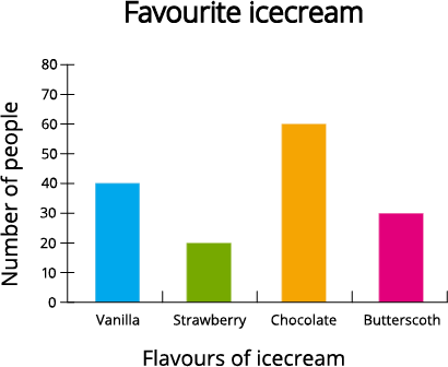
Since the data represented here is along the \(y\)-axis of the graph and the height of the bars gives the values, the above representation is the vertical bar graph.
The same simple bar graph can be represented in the horizontal axis as follows.
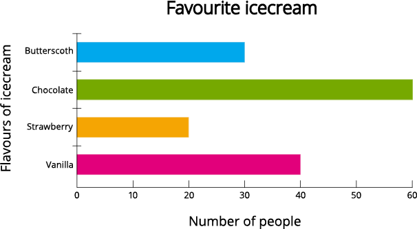
The data represented here is along the \(x\)-axis of the graph, and the length of the bars gives the values.
Also, it is clear from the above bar graphs that bars are of equal width and the spacing between the bars should be the same.
The title of the above bar graph is 'Favourite icecream'.
The \(x\)-axis and \(y\)-axis of the vertical bar graph are named as 'Flavours of icecream' and 'Number of people'. Similar way, the \(x\)-axis and \(y\)-axis of the horizontal bar graph are named as 'Number of people' and 'Flavors of icecream'.
For the vertical bar graph, the number of people considered from \(0\) to \(70\) with \(10\) points increments in each step along the \(y\)-axis. For the horizontal bar graph, the number of people considered from \(0\) to \(70\) with \(10\) points increments in each step along the \(x\)-axis.
 Register for free to see more content